Measurement Error
The climate debate has faded in the bright light of the
election. There are many elements of the discussion that are worthwhile.
This is a bit about temperature measurement. Recognize that most people
believe there is good evidence there is a warming trend. How accurate
the measurements and the implications of the trend are the two important
points of debate.
We have been measuring the temperature at a few select
locations for hundreds of years, but it really is only in the last
century that we have fairly good coverage of the land surface. And even
then our coverage of places like the Antarctic, central Africa, parts
of South America, and all of the oceans (which cover 75% of the Earth)
is even today still spotty. And what should be done with the
information? How do we reconcile the temperature of Oregon with the
temperature of Arizona. Do we add them and average them? Is that
meaningful? A theory has emerged that one can more easily average what
are known as temperature anomalies than one can average the temperature
itself. So researchers will establish an average for one specific
thermometer for a particular day of the year. The exact time period or
even the accuracy of this average is not that important, as long as the
same time period is used consistently. Then, the anomaly for any given
measurement is the deviation of the measured temperature from its
average. So if the average historical temperature for this day of the
year is 25C and the actual measured for the day is 26C, the anomaly for
today at this temperature station is +1.0C. Sounds sensible...but it is a
theory that it is representative.
Although they are different, both the satellite and surface temperature records show warming since 1980. For all that some skeptics may want to criticize the authors of the surface temperature databases, and there indeed some grounds for criticism, these issues should not distract us from the basic fact that in every temperature record we have (including other technologies like radiosonde balloons), we see recent warming.
In terms of magnitude, the two indices do not show the same amount of warming -- since 1980 the satellite temperature record shows about 30% less warming than does the surface temperature record for the same period.
While "the pause" does not in and of itself disprove the theory of catastrophic manmade global warming, it does easily falsify the myriad statements you see that global warming is accelerating. At least for the last 20 years, it has been decelerating.
The surface temperature record shows only about half the warming, and the satellite record shows only about a third the warming, that Hansen predicted.
This is a picture of a temperature station, a center where temperature is measured regularly to determine level and direction.
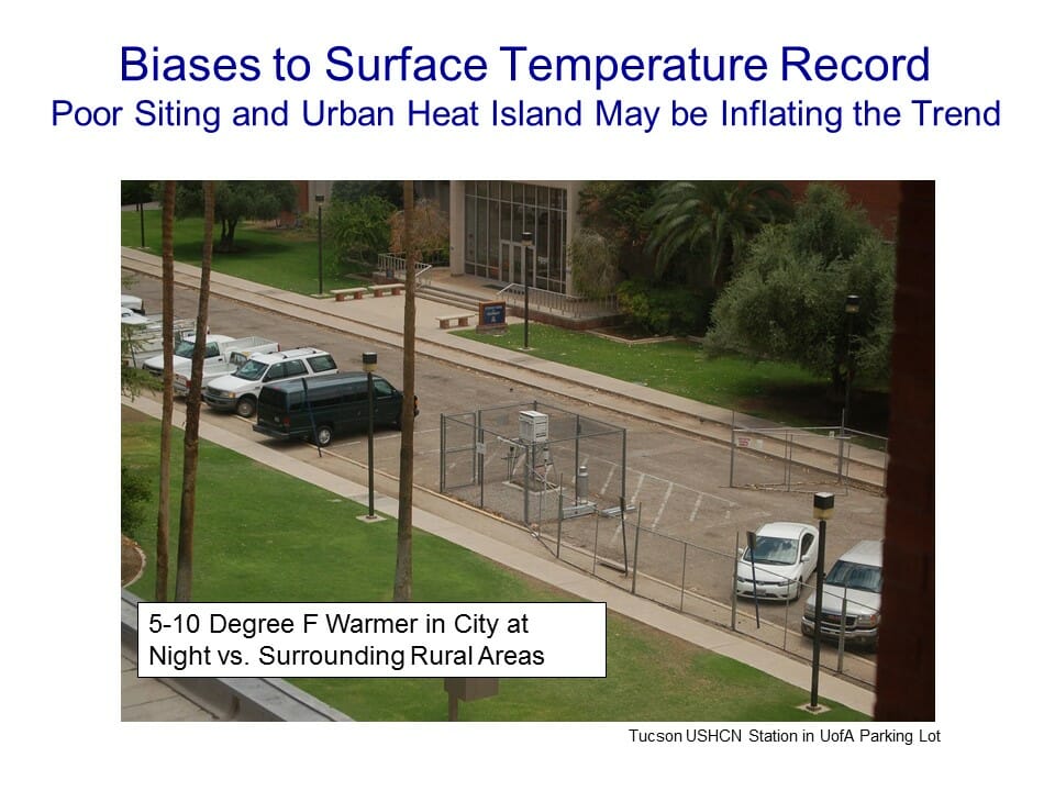
The temperature station is the fenced-in white box (the uproar over this picture eventually caused this location to be closed). It was in the middle of a parking lot in the middle of a major university in the middle of a growing city. 100 years ago this temperature station was in the countryside, in essentially the open desert - no paving, no buildings, no cars. So we are getting the highest warming rates in the country by comparing a temperature today in an asphalt parking lot in the middle of a city to a temperature a hundred years ago in the open desert.
This actually has a name: The urban heat island effect. Buildings and concrete absorb heat from the sun during the day, more than would typically be absorbed by raw land in its natural state. This heat is reradiated at night, causing nights to be warmer in cities than in the areas surrounding them.
There is no conclusion obvious here. But measurement is hard and generalizations from difficult measurements are harder.
No comments:
Post a Comment